Context
- Owner wanted a calm site that matched in-studio service.
- Bookings come from locals who skim fast on mobile.
- Studio team needed confidence to edit hours and promos.
Problem
- Old pages buried services and prices.
- Typography failed readability on phones.
- Edits risked breaking layouts.
What we did
- Rebuilt templates with calm palette and larger touch targets.
- Separated treatments and products into clear, linked sections.
- Left edit notes so the owner can swap offers without calls.
Result
- Faster browsing with service paths visible from the home page.
- Mobile users can read and book without zooming.
- Owner swaps promos without breaking sections.
Before / After / Impact
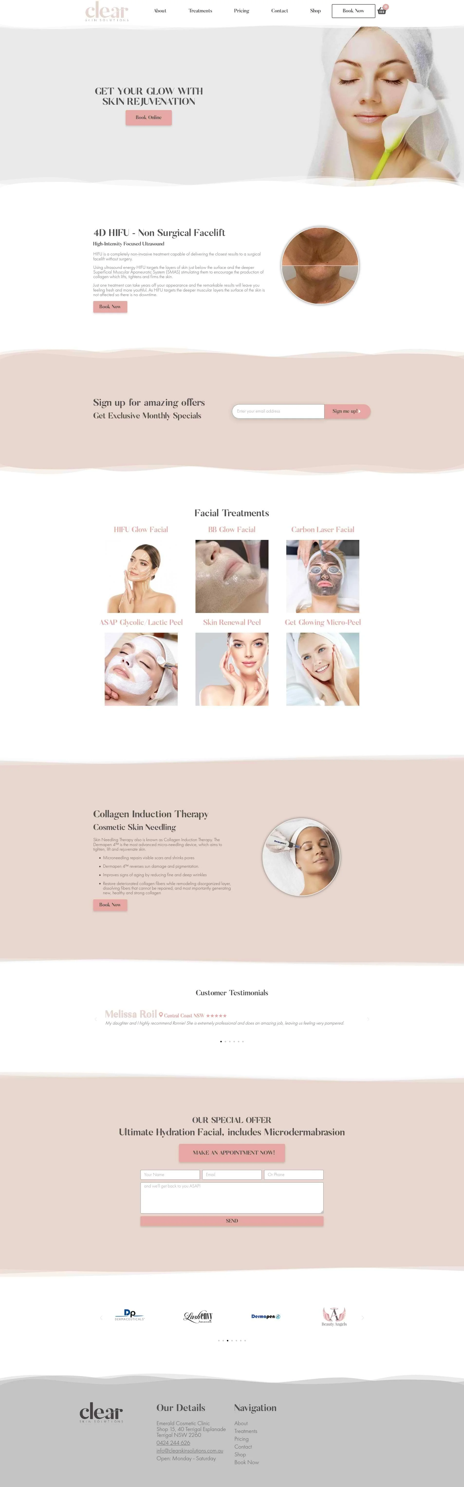
- Before: Dated layout, small text, unclear services.
- After: Accessible sections with calm styling and clear pricing paths.
- Impact: Faster skim time and safer owner edits for day-to-day changes.
Nerd notes
- Elementor with restrained blocks to keep edits stable.
- Typography tuned for WCAG contrast and line length.
- Section anchors for quick jumps to treatments and products.
Status
Live and easy to maintain.